
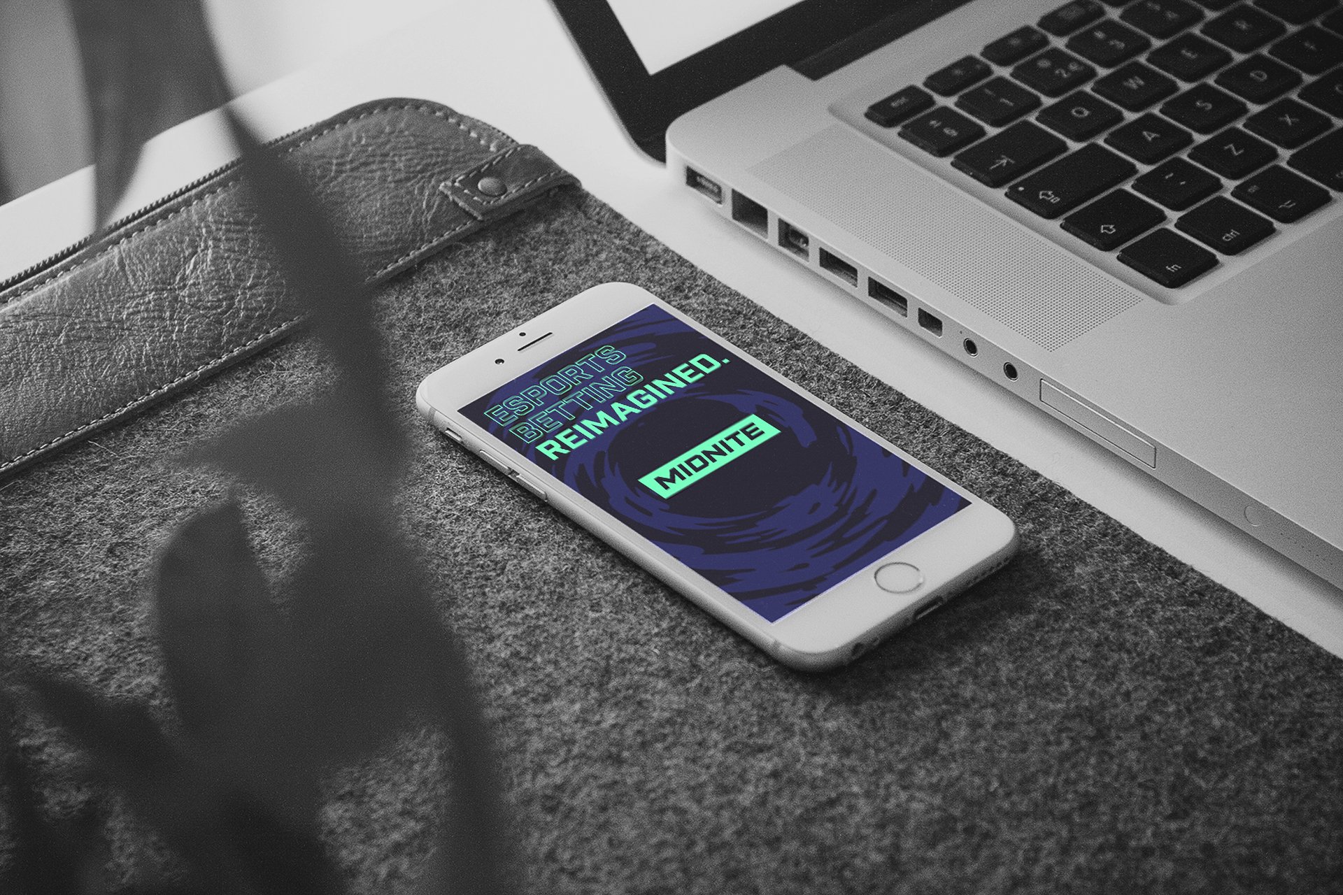
Midnite
—Next-level esports
streaming & betting
Brief
Proxy approached us with an exciting new brand design for an esports streaming company called Midnite. Having been a gamer for my whole life, I was anxious to get my hands on this project.
We extended the new visual identity with bold, animated patterns and action-packed illustrations. Each worked as a stand-alone element and in conjunction with other brand elements.
Creative
Approach
Proxy needed us to continue the visual identity with animated, multi-purpose elements, derived from their new illustrations. We captured the tempo of MOBA and FPS games and merged it with the “focus” theme, which Proxy had envisioned. We wanted to maintain visual and storytelling fidelity with edgy motion and gritty, analog textures.
Animated elements were not created just for the visual bang, but also served functions such as offering temporal bridging between layouts and sections, for example in social media advertising. The elements were required to work in multi-channel environment, where the agency had the ability to quickly create different layouts, add typography, change aspect ratios and colour versions.


Patterns
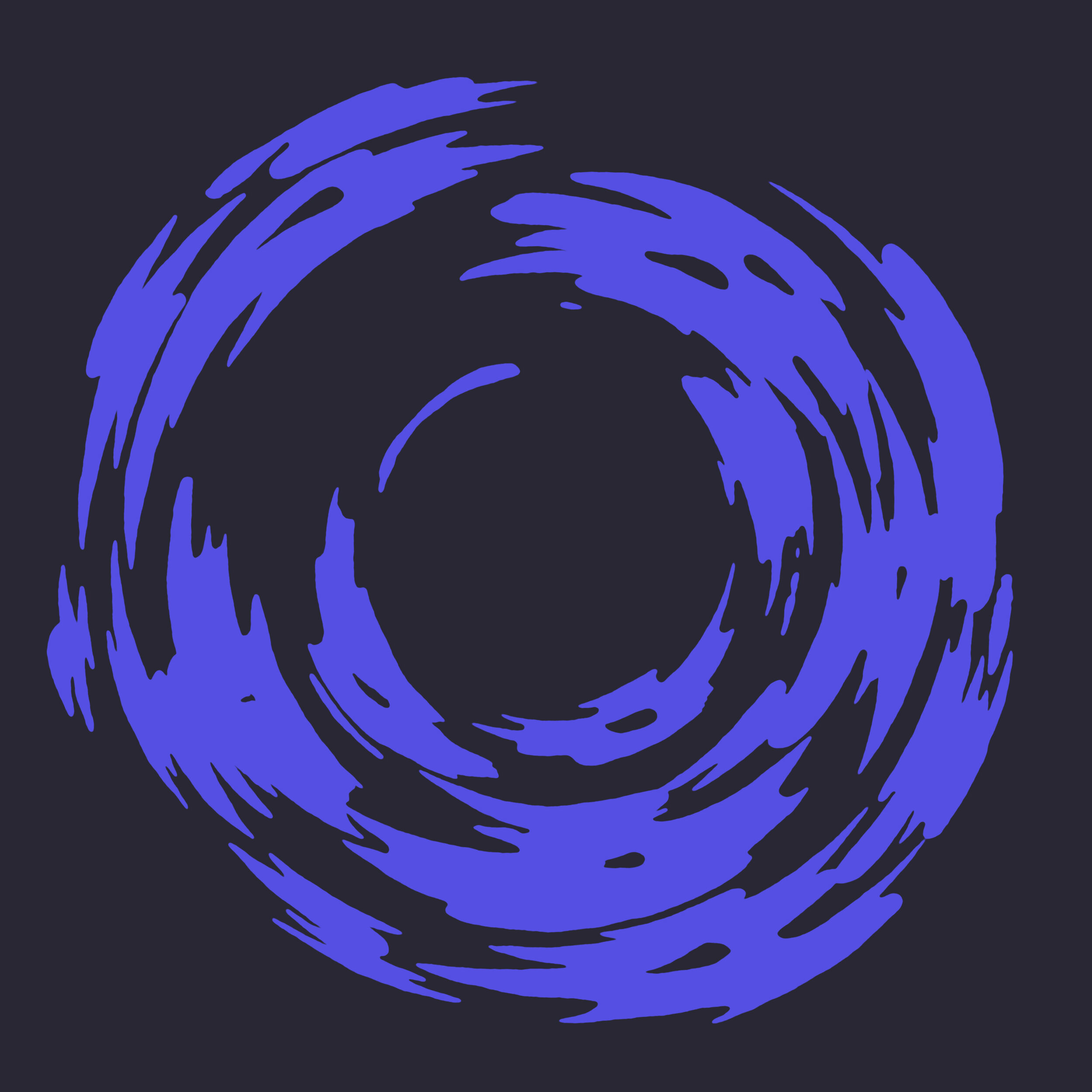


Animated Patterns


Ident


process
When the agency approached us with Midnite, they had almost finished the new visual identity. Illustrations and patterns were delivered to us as vector files. They already had a good idea, what sort of motion and temporal tones would work on top of the established visual language. We used the original artwork as a basis for our animations. Sometimes we could use the vector source files almost as is, but other times a more novel approach was required, where we created the graphics from scratch. In these instances I created a set of tools which helped to review our animations against the originals, to ensure visual fidelity.
The animation design process was a very pleasant experience, since the artworks already had a sense of movement.
The type of motion we were after had a distinct frame-by-frame and hand animated appearance. I chose to separate these effects from the underlying “base” animation, so we had control of individual components. This way we could also experiment with different takes, textures, timewarps and effects and quickly apply them to all the animations, almost like assetising the effects themselves.
Beneath all the analog effects we utilised 3D tools and procedural animation, which gave a lot of control for art direction. It was fun to emulate frame-by-frame animation with parametric design. Communication with the agency was efficient and we were able to deliver new versions quickly. Rendering wasn’t an issue, as we only used solid colours and cell shading.
Dynamic
Assets
From the beginning of the production, we wanted to address the modular and multi-channel nature of the brief and end up with a dynamic toolset, rather than a static set of video clips for the agency’s own video department.
We armed the agency with easy-to-use, “one-click” asset generators, so they could choose different colour schemes and aspect ratios, among other attributes for each animated element.